I
PHOTOSHOOT FOR FIRST MAGAZINE COVER
PHOTOSHOOT PLANNING
Location: At home
Date: 20th October 2020
Props: bags, shoes and stool for model to sit
Equipment: DSLR Camera, Tripod, light stand and white canvas for background
BEHIND THE SCENE
These are some photos that I had taken on the day of the photoshoot and on the right is the image I had chosen to use:
FIRST MAGAZINE COVER
Below is a draft of my first magazine cover:
I decided to change my overall magazine cover and plan a new one. The reason I decided to make a new magazine cover was because the end result of my initial magazine cover does not satisfy me as it looks outdated and lack of appeal. I also felt that this magazine cover will be not be as appealing in order to effectively attract my target audience. At first I planned to create a minimalistic fashion bag magazine however in the middle of creating it, I had a shift of interest and prefer to create a magazine with a more sense of high-fashion and in my opinion my initial magazine cover is far from it, therefore I plan a new magazine cover, first by doing my research on the new type of magazine as describe in my Research and Planning document.
PHOTOSHOOT FOR FIRST MAGAZINE COVER
PHOTOSHOOT PLANNING
Location: Any nearby beach
Date: 26 October 2020
Props: Beige Bag, sunglasses
Costume: overall White & Beige outfit, white shoe
Photoshoot equipment: DSLR camera
DAY OF PHOTOSHOOT
Behind the scene of the model and photographer (myself) before and after shooting:
The location:
Below are photos that I took during the day of the photoshoot. I have tried different angles and poses to achieve the best image possible and in case I needed a different concept photo.
The image I had chosen:
EDITING OF FINAL MAGAZINE COVER

For this photoshoot I had to model myself because I couldn’t find anyone that wanted or were available during the period of time that had to do my photoshoot. This photoshoot was very challenging to me as I can only produce few photos because I had to run back & forth with the timer of the camera. However I am glad that I could find a photo that I would like to add in my magazine. I took these photo in the family room of my house and set up a chair to sit on. I also changed my clothes three times in case I needed different option.


There was no actual set up for my photoshoot as I was only using my DSLR camera to take my photos and rely on the sun to give the natural lighting effect.


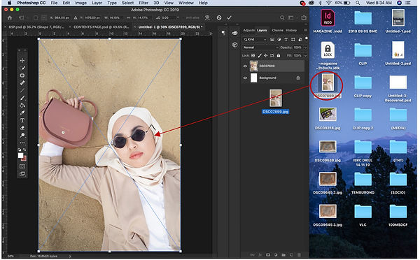
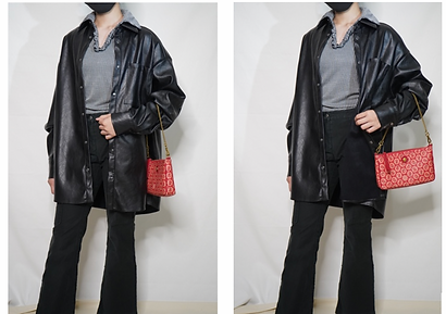
This the original photo that I will use for my magazine cover, I took this picture at a near beach during a mini photoshoot session with my friend, this shot was taken from overhead of the model.
For this picture I only used a Sony DSLR camera as the only equipment for the photoshoot and rely on the sun to achieve a natural lighting. It was a bit difficult for me to take the picture without shadowing the model as of that time I didn’t have any manual lighting tools with me to control the lighting of the set. So instead, I tried to take if from many different angles to find the perfect lighting. I find that the best lighting I can get is when the sun is from the left side of the model and my shadow would be on the side and not onto the model.
I used auto focus setting from the camera to achieve this mid and overhead shot of my model. The reason I had chosen this photo among the others is because the lighting spreads evenly in this photo meaning there is no unnecessary shadow or excessive lighting over the model’s body. Aside from that, I also like the way my model’s poses dramatically on the sand. Her costume blends in with the sand and only the colour of the bag, sunglasses and the lipstick of the model that pops out just like I wanted it.


After I am done with the photoshoot, I transferred the image from my camera to my laptop and then transferred the picture that I had chosen to Photoshop Adobe. I set the document setting to 20cm width, 30cm length and 250 resolution with RGB color mode.
The first thing I edited was the sand, I removed the unnecessary sticks on the background and remove my foot print on the sand with Normal Patch Tools. I used the normal patch tools instead of the Contents Aware Patch Tool is because it looked more natural and it flattens the sand easily.
I used Normal Patch Tool with 50% exposure to smoothens the skin texture of the face by picking the smoother skin area and dragged it to the bumpier side of the face. I also use this technique to remove the facial hair on the models face. Some people would prefer to keep the natural facial hair while others would prefer to remove them, it basically depends on the person’s own preference.
Then I increase the exposure of the image to 20%, decrease the contrast and brightness to -15 and -5 respectively. This is in order to achieve the editorial effect on the image. I will also need this in order make the white coloured masthead and texts popped out.
In this I added the magazine masthead ‘SONSAC’ using Big Caslon font. I set the font size at 119 then increase horizontal length by 130% and increase vertical length by 195% to achieve the right size I wanted for the masthead. I usually prefer when masthead filled the whole space on top of the magazine. I also added the barcode which I downloaded from google, source: https://images.app.goo.gl/KNKhZi3A13BUtE7z6.
-
I did try to change the masthead colour into a gradient beige just to see whether I like it or not. I used Eye dropper tool to pick the colour of the bag. However I didn’t end up liking it as you can see with using darker tone masthead makes the image darker so I change back the masthead to white and it shows how much the image is brightening.
-
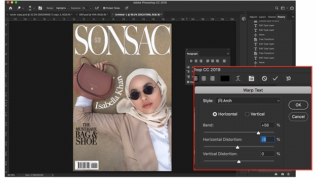
In this draft I also added the date line between the masthead letter and one coverline as well as name of the model in the image. For the date line, ‘JUNE 2021’ I used Calibri light font with 10pt font and increase the horizontal length to 130%. For the cover line I use Bodoni font with different sizes ranging from 10pt – 18pt to align them as well as increase the horizontal length to 140% and vertical length to 130%. For the model’s name, ‘ISABELLA KHAN’ I used big Caslon font and size font 20.
-
I tried to be creative with the model’s name, so I arched the text using the Wrap text setting.
-
However I find the colour of the model’s name, ‘ISABELLA KHAN’ to be a little distracting and awkwardly too bright. Therefore I increase the transparency of the text to 40%.
-
I also rotated the barcode to stand vertically in order to save space for the magazine edition title. On top of the barcode I added the price line.
-
In the middle of editing, I had a change of plan for my magazine contents therefore I also changed the coverline from ‘THE MUST HAVE BAG & SHOE’ to ‘5 WAYS TO STYLE BLACK BAG’.
In this draft, I added the finishing detail of the magazine.
-
The tagline ‘THE ULTIMATE COLECTION OF BAGS WORLDWIDE’ using the Bodoni font. I change the font style to italic so the readers will not get confused between the tag line and cover lines.
-
I added the magazine edition titled ‘THE SUMMER FASHION’ at the bottom of the cover using Bodoni font with 98pt font size. I used Bodoni to match with the coverline but I decided to colour the font white so it brightens the image.
-
I also get to add another coverline ‘ MONOCHROME CHARM outfit inspo’ below the tag line. I decided to use this coverline because it somehow matches with the magazine cover theme which is monochrome. For this cover line I used the same format as the other coverline in order to keep the consistency of the text.
Then I transferred the file to InDesign to check if the texts are not outside the margin line. I found out that the texts were not in line with the margin so I transferred the file back to Photoshop Adobe to move the letter. I repeat this process until all the texts are align with the margin.
l
After starting on my magazine Double Spread Page, I decided to change the whole article hence why I need to also change the coverline in the magazine cover from ‘5 WAYS TO STYLE BLACK BAG’ to ‘4 WAYS TO STYLE BLACK & WHITE OUTFITS’.
I had also increase the saturation of the image layer to +4 because I thought the colour of the previous draft looked a bit faded and desaturated.
1.
2.
3.
4.
l
5.
l
6.


FIRST COMPLETED MAGAZINE COVER
UPDATED MAGAZINE COVER
COMPLETED FINAL MAGAZINE COVER


MAGAZINE COVER
MAGAZINE CONTENTS PAGE
L
PHOTOSHOOT FOR CONTENTS PAGE
PHOTOSHOOT #1
The first photo is the one I reused from my first magazine cover. I really like this photo and it would save me some times if I reuse it for my contents page. Refer to first magazine cover to see the photoshoot of this image.
PHOTOSHOOT #2
PHOTOSHOOT PLANNING
Location: School Studio
Date: 3rd December 2020
Props: bags
Equipment: DSLR camera, Tripod and Photo box set with LED light
DAY OF THE PHOTOSHOOT
One the left are the photos I had taken of the photoshoot and on the right are the two photos I decided to use for my contents page:
In the middle of editing, I had a bit change of plan on image my layout.
I decided to put the bags and make up product separately instead of doing this.
PHOTOSHOOT #3
PHOTOSHOOT PLANNING
Location: home
Date: 10th December 2020
Props: Revolution make up collection, Maroon cloth
Equipment: DSLR camera
PHOTOSHOOT SET UP
I did the photoshoot in my bedroom, specifically on bed because the lighting is good with the sun reflecting directly on my bed. I layered a piece of maroon cloth on my bed for the background.
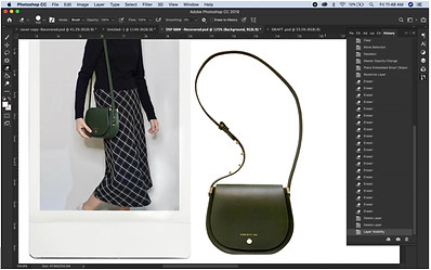
On the left are some of the photos I had taken meanwhile on the right is the image I had chosen to include in my contents page.
I preferred this image because it is simple and the colour palette of the image matches the overall colour scheme of the contents page. I also like the natural light effect of the image.
I used Photoshop Adobe and InDesign application for editing. The editing part is explained further on my ‘Editing’ document.
EDITING FOR CONTENTS PAGE


I started off my contents page editing on Photoshop Adobe. I set my contents page document setting to 20cm width, 30cm length and 250 resolution with RGB color mode.
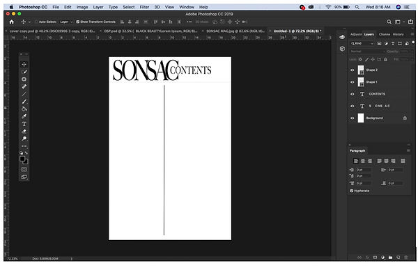
In this draft I had just made the heading with the magazine masthead ‘SONSAC’ and the word ‘CONTENTS’ to indicate that this is the contents page. I used Big Caslon font for the heading with font size 66pt for ‘SONSAC’ and 24pt for ‘CONTENTS’, I also increases both the horizontal length by 195% and vertical length by 130% and shorten the space between the letter to -190 in order to achieve the perfect size for my heading.
In this draft I had the added the images of bag and the model’s outfit. For the model’s outfit image, I had to brightened up the photo because it was too dark, I used Dodge tool in shadow mode to brighten up the photo.
I remove the background the bag using Eraser tool and a Wacom pad to ease my work.
In this draft, I used a png images of a sunglasses, a bottle of perfume and a lipstick from google to envision the items around the bag before deciding whether or not I want to continue with this idea. somehow I did not like it as much because it looks a bit scattered to me so I had changed my idea from the layout plan that I made for the contents page.
Since I changed my plan for the contents page layout that I made, I took a new photo that I will use for the contents page. I then inserted the image of revolution make up product that I had cropped into 1:1 image ratio.
Using the Horizontal Type Tool, I inserted my magazine articles altogether in the document. Upon seeing me do my text editing in Photoshop, one of my tutors suggested that I should edit the text in InDesign instead because InDesign has more option on text editing and also provide grid and guides for the texts.
I deleted all the article texts since I will be editing it on InDesign. However, I decided to include another image of a bag into the page since the page still looks bare. I used one of the photos that I had taken when I did photoshoot of the gold bag. I then use Eraser tool and a Wacom pad to remove the background of the bag, same as I did for the gold bag.
After editing on Photoshop, I moved my contents page to InDesign to edit the texts.
FONT SETTING:
First thing I did on InDesign was to add all my magazine texts including the article titles, descriptions and their respective page numbers using the Type Tool.
I tried changing the sub categories font color to blue because blue is a complementary color to red. But it did matches the contents page so I tried picking colors from within the contents page itself. So, I changed it to dark red that matches with the first image. I ended up liking the red color more because it is consistent within the color scheme of the contents page.
This is the font setting I used for the page number on the image:
In this draft, I added the page number on the images referring to which article it belongs to.
This is the final changes I has on my contents page, since some page number blends in with the first Image, I decided to increase the tint of the font to 28 in order to make it lighter and visible on the image. I had also changed one of the article page number 33 from ‘5 WAYS TO STYLE BLACK BAGS’ to ‘4 WAYS TO STYLE BLACK & WHITE OUTFITS’ after I decided to change my double spread page plan.


1.
2.
3.
4.
5.
l
6.
7.
8.
9.
10.
11.
12.
13.
FINAL MAGAZINE CONTENTS PAGE

DOUBLE SPREAD PAGE
PHOTOSHOOT FOR DOUBLE SPREAD PAGE
PHOTOSHOOT #1
PHOTOSHOOT PLANNING
Location: home
Date: 26 th December 2020
Props: 4 bags & 4 shoes, polaroid frame, White canvas for background
Costume: 4 set of outfits
Equipment: DSLR camera, Light Stand, Ring light, Stool to put the camera
DAY OF PHOTOSHOOT
Behind the scenes:
For this photoshoot I also had to model myself as no one was available and wanted to model for me during this period of time.
These are the photos I had taken of the photoshoot.
Below are the images that I had chosen to include in my contents page:
After taking these images, I transferred them to Photoshop Adobe for editing the images.
EDITING FOR DOUBLE SPREAD PAGE

LIGHT STAND
RING LIGHT
STOOL TO PUT MY CAMERA
WHITE CANVAS


For my Double Spread Page, I did the same with editing from Photoshop then to InDesign.
I set my double spread page document setting to 40cm width, 30cm length and 250 resolution with RGB color mode.
The first thing I did was transferred the picture of the polaroid to Photoshop. The I adjust the angle of the image using the Free Transform Warp Tool so that the polaroid is in a perfect rectangular shape.
I use Rectangular Marquee Tool to set the rectangular selection for me to erase and for erasing the image I either click ‘delete’ or use the Eraser Tool. I remove everything and only kept the polaroid frame.
After I completely erased the background, I duplicated 3 layers of the polaroid.
Then I inserted the outfit images that I like to include in my double spread page.
I merged down the layers, each image of the outfit with their polaroid frame so it will be easier for me to move them around the page when I need to.
I opened a new document for me to experiment on the tittle design before adding it to the actual Double spread page.
-
I created a rectangular box using the Rectangular Tool for me to use as the column guide before typing the article title ‘4 WAYS TO STYLE BLACK & WHITE OUTFIT’. For this text, I used Fashion Didot font.
-
Then I adjusted the font size to make sure that all the words are inside the box, I did this to manually justify the text.
-
I wanted to make the words appear as if they are squeeze in a box so I altered the leadings of each words so that the spaces between them are equal and minimize.
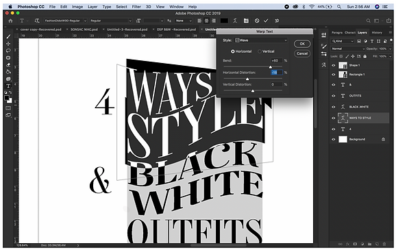
In this draft I experimented with the Wrap Text and decided to use the Flag style and increase the bend by 17%. I had also changed the font for BLACK WHITE to Famosa (Black Demo) font to add more style to the typography.
I continue experimenting the Wrap Text For the other wordings. I used the Wave style for the ‘WAYS TO STYLE’ and ‘OUTFITS’ wording. However, when the wordings are bend and the letters expand, the text also lost its alignment or in other words lost its parallel sides.
-
Therefore, I go to filter and manually liquify it using the Forward Wrap to keep some of the sides parallel and perpendicular, this is in order to keep the squeeze-in-the-box effect.
In this draft, I had completed the article tittle design look that I wanted to achieve.
-
Before completing this article title, I made a number of changes including the font color for the word ‘White’.
-
The number 4, which I changed then font to Henri Didot and increase the horizontal scale to 180% and the vertical scale to 130%.
-
I also decrease the font size of the ‘&’ symbol to 30pt font so it does not look too side tracked from the rest of the wording also to minimize the space.
After I completed the article tittle design, I copy and paste it onto my actual double spread page document. And then continue on editing my images.
After a few reviewing on my images, I realized that one of the images that I have included had its bag titled away and not properly showed on the image, so I tried to find another image that I can replace it with. Unfortunately, the other photos that I had taken of the outfit is not as good as this one, however, there is another one image that I took from the same multiple-shot but the leather jacket folded and the bag showing, so I just cropped the bag part from the second image and fix it onto the current image.
-
To do this I first inserted the new image onto the document then decrease the opacity of the image in order to match the size with the current image. Then I use the Eraser tool to erase the unwanted area.
-
Then I fixed the background using Patch Tool or even using Brush Tool to drew on some part of the jacket if necessary. I used Wacom while doing most of these for easier navigation.
After I am done with the fixing, I inserted all the other images of bags that like to include in my Double Spread Page.
I do the editing of my bags one by one, starting with the bag in the first page.
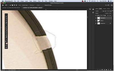
First I remove the background using Eraser Tool. After that, fixed the area that has tape on it by first erasing the tapped part and then using Content-Aware Patch Tool with the structure setting on 7 in order to replicate the erased part. And lastly for this bag, I used the burn tool to darken the color of the bag in order to match the color of the bag in the polaroid.
The first thing I noticed about this bag is that the lighting on the metal belts was not balance with one is darker than the other, so what I did was, using the Content Aware Patch Tool, I replicate one of the metal belts with the other. Then to properly adjust the belt I go to Filter then clicked Liquify in order to adjust the angle of the metal belts and also straighten the image of the bag itself. After that, I tried matching the color of the bag with the one in the polaroid, to do this I use the Burn Tool in Mid tone Mode with 26% exposure and the Dodge Tool in Highlight mode with 10% exposure. Lastly using my Wacom Pad, erase the background of the bag using Eraser Tool.
For the third bag, I fixed the area that has tape on it by using Content-Aware Patch Tool with the structure setting on 7 in order to replicate the erased part. Then just remove the background using Eraser Tool.
For the last bag, I first go to free transform and tried to fix the angle of the bag, then go to Filter to liquify the handle of the bag for the purpose of fixing the bag’s handle. After that I remove the background of the bag using Eraser Tool and my Wacom. Lastly for this bag, I use Sponge Tool in Saturated Mode to give a bright yellow effect on the lock to match with the image of the bag in the polaroid one.
AfterI finished editing all the bag, I then just fix the overall layout of the images within the Double Spread Page.
In the middle of editing this Double Spread page, I came out with an idea to change the background color of the Double Spread page because I wanted to show the consistency of the overall magazine. I click Window to change the arrangement to 3-up Vertical View to compare all my magazine work including the magazine cover, contents page and the double spread page.
-
Using the Eyedropper Tool, I click on the nude colored bag from the magazine cover to use for the color scheme then using the Paint Tool I colored the background nude. At first the nude background appeared too dark and blends with the bag so I click on Color Picker to get a lighter shade of the nude. I then used the Paint Tool to color the background once more.
Then when I am done editing all the images and the magazine article tittle in the Double Spread Page, I exported the document into a JPEG file to be edited again in InDesign.
On InDesign, the first thing I added was the page number and the small sized SONSAC masthead on the bottom of the page just like what I did with my contents page.
This is the font setting I used for this text:
Then I inserted the text containing information on the bags brand, edition and price that I proof check some of them from Google. The small sized font is part of the convention in fashion magazine.
In this draft, I had added the two main paragraphs on the left page. The reason I had set the main paragraphs font white is so that the readers can easily recognize which one is the main paragraphs and which one is the content paragraphs. I had also used numbering on the images so that the readers can easily remember which one is the first look, second look, third look and the fourth look and it also makes the double spread page looks more organize.
In the contents paragraph I had added information on why the readers should buy the bags and where she can wear them. I placed each information on the side of which it belongs to so that readers can refer to them easily.
This is the final draft of my magazine double spread page. I had made a number of changes in the layout of the paragraphs and even go back to Photoshop to move a few images around.
-
In Photoshop I had move the first image to the center of the page in order to give space for the main paragraphs. Since I moved the polaroid image I had to also moved the image of its bag as well as it’s respective paragraph information.
-
The reason I had moved the two main paragraphs on the very left is so that when the readers open the page, the first paragraph they read is the main paragraphs. I had also made the font of the two main paragraphs slightly larger than the content paragraphs so that the readers are aware that it is the main paragraphs.
-
I also added a few more text on the double spread page which includes the made up name of the author LILA MIZAHURA as well as a tag on the polaroid frame.
-
For the paragraphs, I had justified the column and make sure that the texts are in line with the other paragraphs. I had also adjusted the last paragraph to so the page looks neater because before this, the paragraph looks out of place.
-
In the end I just made sure that There is no wrong spelling and the texts are within the guideline or margin.
First I remove the background of the Double Spread Page and use the Horizontal Text Tool to make my paragraphs visible by changing its font color from white to black. I had also added article title ‘4 WAYS TO STYLE BLACK & WHITE OUTFITS’ using Backlash with 48pt font size which is now half the size of the original article title.
Then I inserted all the items individually into my InDesign document so that it is easier for me to move each item around my Double Spread Page without affecting the other images. Then I dragged one polaroid image on top of the other to match its size. To do this increase the transparency of one of the polaroid images and then use the other one as a guide size and then repeat these same steps for all the polaroid images to make sure they are all the same size.
In this draft, I arranged my images like it before, then changed the article title font to Fashion Didot and Uppercased the who title to match the contents page typography for consistency.
Since the article title is now smaller in size compared to before, It had left my Double Spread Page with a lot of awkward blank spaces so I decided to add more texts by elaborating on my article paragraph. Then I arrange my article paragraphs into 3 columns to match with the right page. I also used Drop Cap on my first article paragraph so that the readers can easily find the beginning or start of my article.
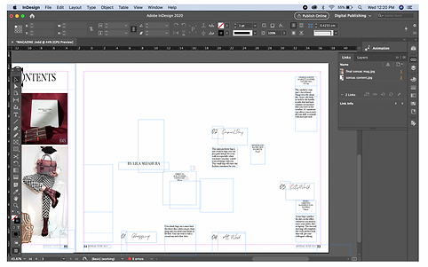
Using a 3-column guide with 1p0 column gutter and 3p0 margin setting on all sides, I arrange my texts and images so they are align with each other and that they are not outside of the margin. This step in particular is to make my Double Spread Page looks neater and well organized.
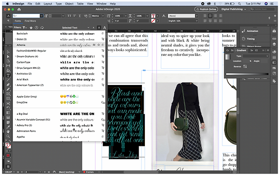
Since the page still looks bare, I decided to add a pull quote on the left page, I used Athenia font in maroon color because it gives the page more feminine character and so that the page does not look too simple. I used marron on for the text font in order to match the magazine color scheme. Then I add two lines using the Line Tool to separate the pull quote from the others.


CURRENT ADDED


FIRST COMPLETED DRAFT OF MAGAZINE DSP
EDITING FOR FINAL MAGAZINE DSP
After having a review session with my subject tutors on my work, they pointed out that my Double Spread Page does not seem to be consistent with my overall magazine and does not have the quality of a typical high fashion magazine. So, I refer back to my research and planning document to look for inspiration. What I realize is that most of the DSP magazine that I did research on, they use white background to make the Double Spread Page look simpler and also allow more focus on the items and texts instead. Therefore I intended to follow this convention to improve my DSP. My tutor had also pointed out that my article title is too big and unnecessarily attract too much focus due to its unusual character on the font. At first I wasn’t aware of how distracting the article title was until I asked my other peers who usually typically reads fashion magazine, they had commented the same.
Using this information, I decided to change my background to white and change my article title’s font to a simpler one and also decrease the font size so it only occupies less than one-third of the page. I go back to InDesign to redesign my layout.


1.
2.
3.
4.
5.
6.
7.
8.
9.
10.
11.
12.
13.
14.
15.
16.
17.
18.
19.
20.
21.
22.
23.
24.
25.
26.
27.
28.


FINAL COMPLETED MAGAZINE DSP
