For my first class project we were individually assigned to produce our own magazine containing it’s cover, one contents page and a double spread page while experimenting on both Photoshop Adobe and Indesign . To begin, I first decided which type of magazine I want to create and I had chosen to create a student magazine in which case I thought would be easy as I am a student myself. The other reason was because I wanted to provide a platform specifically for students to share voice, ideas and talent with the school community. I want them to have the freedom in expressing their thoughts and opinion. Whatever they feel like sharing, that includes story telling, tips & advice, opinion as long as it is appropriate for school students. I also want to let students start their writing career from writing for the school student magazine.
MAGAZINE COVER
After deciding that I am going to create a student magazine, I started taking photos of things which I think is relevant for my student magazine. Since I was planning to do the photoshoot in school, I was not concern in preparing the things that should be in the mise-en-scene as my magazine is already related to students in school. For the photoshoot, I borrowed my dad's DSLR camera and called my friend to be my model. To get the best outcome, I took as much photos as possible and experiment different angles and poses so there are more options to choose from later. I had also took photos at different location in the school including the student learning area, the school library and at the library's stair. The mise en scene of the image includes school as the setting, a book for the prop and the model to wear her school uniform to indicate her role as a student.
Below at the left is photos that I took of that day and on the right is the picture I initially decided to use for my magazine cover.
After we were done with the photoshoot, I went on Google to research on what a magazine cover should contain. With the research I had done on google and from the previous lesson I had in class on the topic ‘Magazine Convention’, I started planning on how I want my magazine cover to look like. I had also used an App on my mobile phone called 'Nichi' to visualize my plan.
After showing my layout plan to my subject tutor, she told me that I need to redo my magazine cover plan as I was not following the magazine format. At first I was confused because I was not aware at that time that there is a specific magazine cover format. So I did a further research on a student magazine format.
After further research, I made a number of significant changes to my first magazine cover plan, that also includes changing the photo that I will use for my new magazine cover because I assume that the previous photo will not be effective in attracting buyers because
Below is the image I will be using for my new magazine cover:
Since I had also changed most of my magazine layout, I had made a new layout plan for my magazine, below is the planning:
MASTHEAD – Since the initial masthead FREEDOM SCHOLAR and was too long, I tried to find another shorter name suitable for the masthead. I came up with 'STUDENSE' which is from the combination of the words STUDENTand DENSE. The reason I chose this name is simply because the target audiences are students meanwhile the word DENSE refers to heavy topics that will be discussed in magazine. I plan to use Bodoni 72 font for the masthead because I think it looks formal and neat. I also made the word STU and DENSE have different typeface so that the readers can understand that the masthead are two different words combined. I will use yellow for the font color because it represents optimism and creativity and it also contrast the background.
TAGLINE- the previous tagline YOUTH'S BEST READ sounds too broad, so I changed it to MADE FOR STUDENTS to further emphasize who the target audience are.
BARCODE/ DATELINE/ PRICELINE-I also changed the placement of the barcode, dateline and price after learningthe format. In the first magazine, I put them on the top right of the cover and now I moved them to the bottom left so it does not distract the masthead. The price tag was also out of place so I moved it to be align with the dateline and to be above the barcode. Meanwhile, the price tag remains $3, only it’s placement will be changed.
COVER LINES- For these, I will use Futura because it is simple and can easily be read. I made the font to be blue in color because it is complementary to the yellow masthead. Blue is also the color of Education. I did also changed the cover line titles after I made my contents page, so that the topics in the cover magazine are also in the magazine contents.
MAIN COVER LINE- I will use Bodoni 72 for the main cover line in order to match with the masthead and made the color blue to match with the other cover lines . However I will make sure that the main coverline appears larger than all the other cover lines so it stands out.
After I made the new plan, I carried on with the photo editing first in which I transferred the new photo to Photoshop Adobe . First making sure the layout of my magazine: (20cm width/ 30cm height/ portrait). Then I started on with removing items in the image which I think is not necessary or distracting using Patch Tool and Content-Aware Move Tool . This includes removing the school batch, pencil case and thread strands.
To remove skin blemishes, I used Spot Healing Brush Tool and brightened the eye-bag area using Dodge Tool.
Then I adjusted the image to black and white, I changed the image B&W because I don't like the background color of the original image, and I thought making it B&W will allow the texts to stand out and avoid blending with the main image.
Using Horizontal Type Tool I inserted the texts including Masthead, Main Cover Line, Cover Line, Tagline, Date and price. After that, I used Eraser Tool to erase some part of the Masthead so the person on the main image can crop out.
Finally, I inserted barcode. ( source: https://images.app.goo.gl/YnUhTGMLRF9n4amc8 ).
BELOW IS THE FINAL DRAFT OF MY MAGAZINE COVER
MAGAZINE CONTENTS PAGE
I did my research first before starting any work, I flipped through a whole magazine collection to see what a contents page looks like, I look through Times magazine and Reader's Digest to find inspiration for the layout.
After I found the inspiration for my contents page layout, I started researching potential topics that I will include in my magazine contents page. I wrote a list of potential contents on a piece of paper. I came out with most these ideas from watching youtube videos recommended for students.
The list of topics include:
LETTERS FROM THE EDITOR
THE BEST FOOD FOR OUR MENTAL HEALTH
WRITER’S GUIDE turning passion into action
GENERATION Z unpopular opinion
ONLINE LEARNING TOOLS 10 trending apps to try out
ATHLETIC TRAINING by Iman Sulaiman
STUDENT OF THE YEAR by Nisa Julaihidden
BOOKS EVERY STUDENT SHOULD READ
HOW TO BEAT PROCRASTINATION AND GET THINGS DONE
TEACHERS VS STUDENTS how to cooperate
PERSONAL STUDY TIPS
HISTORY OF UNIVERSITY Brunei Darussalam
STUDY NOTES TIPS
THE GREAT FAMILY INFLUENCE
GREEN DAY CAMPAIGN
COLLEGE: EXPACTION VS REALITY
ANUAL DEBATE COMPETION 2020
HOW TO 'ME' DAY
WHAT TO DO DURING ESSAY CRISIS
JOURNAL ENTRY SUBMISSION FOR NEXT MAGAZINE
To sort the topics that I will be including in my magazine, I created a quick survey and post it on my social media for people to response. I included the 10 most picked topics into my list of articles.
The current list includes:
THE BEST FOOD FOR OUR MENTAL HEALTH
WRITER’S GUIDE turning passion into action
GENERATION Z unpopular opinion
ONLINE LEARNING TOOLS 10 trending apps to try out
ATHLETIC TRAINING by Iman Sulaiman
STUDENT OF THE YEAR by Nisa Julaihidden
BOOKS EVERY STUDENT SHOULD READ
HOW TO BEAT PROCRASTINATION AND GET THINGS DONE
STUDY NOTES TIPS
COLLEGE: EXPACTION VS REALITY
ANUAL DEBATE COMPETION 2020
I added LETTERS FROM THE EDITOR and JOURNAL ENTRY SUBMISSION FOR NEXT MAGAZINE because I personally think it is an important part in the contents page.
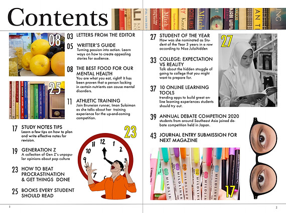
The hardest part of doing my contents page was finding the picture for each title. I wanted to take picture outside from my home, and ask my friends to model for me, however due to the covid 19 situation, I can't meet up with my friends. I thought of drawing a few more for the images but it would take me days to finish the illustration. So I had to improvise the picture although there wasn't anything much in my house at the moment .
From my research, I found that lemon reduces anxiety, grape can also improve mental health according to a site so I took some these fruits from the refrigerator then take picture of them for one of my topic THE BEST FOOD FOR OUR MENTAL HEALTH. For the next image, I stacked my books and set the lighting of the room and took pictures for the topic BOOKS EVERY STUDENT SHOULD READ. Same goes to the image of highlighters for STUDY NOTES TIPS. Then I transferred it to Photoshop to remove the spoil on the fruits to make it look fresher. Then I change the color balance with the other photos so that the color synchronized when I put it in the contents page.
The image that ends up in the contents page is based on whatever I can find in my house.
I set the layout using InDesign. First I layout the images where I think suits best according to the color scheme.Then I typed out all the article titles that will be included by referring to the draft I made earlier. I used Futura font for the contents page to match with the Double Spread Page I made earlier. I divided the contents into 3 columns so they will not blend with the Images.
There were still spaces left on the contents page but I didn't want to change the size of the image or the font. So I go to Photoshop and did the eyes and spectacle image just to fill the space. I chose eye with glasses because people always relate smart people with spectacle (although stereotyping is not usually a good thing). I also use the previous illustration that I made for my DSP and change the size to fit the space. At first I was not happy at all with the result but considering the effort I put in creating this, I am proud of myself to say the least.
BELOW IS THE FINAL DRAFT OF MY MAGAZINE CONTENST PAGE
I made a mistake of making 2 contents page instead of one so I just cropped them in to just one page.
MAGAZINE DOUBLE SPREAD PAGE
Before I began making the content, I did some research on what topic students are interested in. I did find a few topics that I am interested to write about but when I began mind mapping the ideas for each content, I found myself procrastinating a lot in the process because I struggle to put the ideas together. So to get myself a little motivated, I watched a few videos on youtube on how to stop procrastinating. Then I thought why don't I write about procrastination since I watched this many videos. Initially I wanted to write about what is the idea of procrastination but I thought giving tips on how to stop procrastinating would be more beneficial to readers.
DOUBLE SPREAD PAGE PLANNING
ARTICLE TITLE- I stumbled on the topic "HOW TO BEAT PROCRASTINATION & GET THINGS DONE" while I was doing my research.The article I made are inspired by watching Youtube videos and from my own experience. I will use Futura font so that my texts fonts stays consistence throughout the whole magazine following my magazine cover cover lines and my double spread page.
QUOTE- I found this quote "FACE THE DEMANDS OF LIFE VOLUNTARILY. RESPOND TO A CHALLENGE, INSTEAD OF BRACING FOR , CATASTROPHE" from a famous Canadian author in one of his interview when he talk about his motivation in life, He is also famous for his motivational talk and interviews. I often watch his interview to get inspired so it would make more sense for me to quote him. I will use this quote as it relates to the topic of the article.
COLOUR SCHEME- The choice of colors for the image and article background are inspired by the magazine cover which is yellow and blue. The color I had chosen are bright and saturated so it can appeal to the readers. The color of the text on the right page will be white so that it can contrast the blue background in order for it to be readable.
ARTICLE- Paragraph titles are numbered and typed in capital letters so it would be more visible to readers. I chose the Futura for the font because it is neat and easier to read.
After planning, I proceeded to take photo for my DSP. I struggled with finding the right picture for my DSP. I took a few photos of myself but there wasn't any photos I completely agree on. The problems with the photos are with the setting and color. It doesn't picture the image that I had in mind, so I tried drawing instead. I use this picture as my reference (https://images.app.goo.gl/VknSfoJY8dmDzqQp8). I drew the picture on a paper then I scanned it through my phone. I use an app called 'CONCEPT' and using stylus pen to draw the whole image.
But when I transferred it to my laptop it wasn't as clear as it was on my phone, so I used Photoshop Adobe to fixed it and give a little color on the image.
After I have my content and image ready, I used InDesign to set the layout.
From the review, my DSP was dull and lacking colors. The paragraph was also a bit lengthy.
The I get back to Photoshop to add a little color on the illustration. Then I simplified and fixed my wordings and number the paragraphs.
However I wasn't satisfied with the outcome, especially with the image because it was too plain for me. So I get back to photoshop to get more creative with the image. I used this (https://thumbs.dreamstime.com/t/handsome-black-man-screaming-excitement-young-excited-casual-white-background-66249018.jpg) as an image reference for the new detail. I used WACOM to draw.
After I completed the image, I go to InDesign to fix the layout and create an outline for the page. I moved the tittle to one page and add credit to illustrator and writer which I had forgotten to do in the first DSP.
BELOW IS THE FINAL DRAFT OF MY MAGAZINE CONTENST PAGE
BELOW IS THE COMPLETE COMPILATION OF MY MAGAZINE WORK
PERSONAL EVALUATION
How did my magazine brand challenged the convention?
For this magazine, I often see news about how in some countries, female are not allowed to get their education because they believe that female should be doing housework and not learning about science. I was inspired when I first heard about Malala and her protest for female education. To challenge the convention, in this magazine, a female student is the one representing the student of the year. Showing that female are also capable of achieving higher education. As the one responsible for publishing the content, I feel like it's a responsibility to be fully aware of what we are delivering in the media can effect people's view.
How can my magazine be continued and distributed?
The contents for the magazine are 100% students own material. Contents are also voluntarily made to whoever feel like expressing their ideas as long as they are students. There need to be an official form for students when they want to submit their articles. Unfortunately there would be a limitation on how many articles are to be published in the magazine. I, as the editor would have to sort the magazine that will be published.
In terms of distribution, a new magazine will be published every month and students wil have to buy it online so that there will not be extra magazine printed as it would be waste of copy. There will be a student responsible of delivering and distributing the magazine around the school.
How did my production skill developed throughout this project?
I have learned so many things from doing this project especially in terms of the processes behind making these magazines. Initially I did not realized that there are so much research and planning that has to be done in order to create a magazine, in my first attempt of creating the magazine cover, I did not do proper research on the contents of my magazine before starting making the magazine. I took the random pictures and expecting them to work out without having a content planned out earlier, thus I had trouble finding the right contents that matches the picture. I figured out that it was not the right way to create a proper magazine. Another thing that I learned and I think is very much beneficial to me is when I learned about the magazine conventions, I was also not aware of this matter at first. Now that I have learned the convention of making the magazine layout, I am able to create a magazine with a better quality. Although there are still a few mistakes that I made in my magazine, I am now fully aware of what to do to improve my magazine in the future.
FILM
PRELIMINARY EXCERCISE


MASTHEAD - 'FREEDOM SCHOLAR' refers to a person who specialized in freedom of thoughts and the freedom of seeking knowledge. I used this phrase as a reference to what students should encourage to become, which is being open to explore their own opinion.
TAGLINE- YOUTH'S BEST READ, I use this tagline to convince to my target audience that my magazine will provides great reading contents for them.
MAIN COVER LINE - 'BALANCE LIFESTYLE TIPS FROM A STRAIGHT A STUDENT', I made this article into the main cover line because I believe that it will interest other students to read. Moreover by making the font larger, it will help to attract the readers attention.
COVER LINES- 'ADJUSTING TO ONLINE SCHOOL FOR FIRST TIMER' ,'WHAT'S THE BEST MUSIC TO LISTEN WHILE STUDYING', 'MANAGING PART TIME JOB WHILE DOING FULL TIME SCHOOL' and 'STUDENTS STRUGGLE WITH CONSTANT PRESSURE AND SOCIAL LIFE'. These cover lines were inspired by titles from youtube videos that I've seen while searching videos for students. I figured these topics are popular among students in today and so I decided to use them as my coverlines. I had also layout them on a strip so that it looks neater.
DATE LINE- The reason I put the date line on the top right is so that it would be easy for readers to find them.
PRICE LINE- I decided that I want to sell my magazine for $3 because I want it to be affordable for students especially those who are not working. I had put it on the right top of the page so that it is easy for potential buyers to see as it is also near the date line.
BARCODE- The barcode is placed on the bottom right so that it is easy to be scan, I realized that barcode is always put somewhere at the bottom so I did the same.


MAGAZINE
PRELIMINARY EXCERCISE

Below is the slides that I made for presentation to my class on the film practical that we had:


